Table of contents
Colour Theory
This is a sufficiently complex (and controversial) topic to be covered in an article, but we want to leave the main elements that can guide or make one understand if colours really have any effect on the psyche or emotions and are therefore likely to alter states of perception.
In 1666, the English scientist Sir Isaac Newton discovered that when pure white light passes through a prism, it separates into all the visible colours. Newton also discovered that each colour consists of a single wavelength and can no longer be separated into other colours.
In that past, other experiments showed that light could be combined to form other colours. For example, red light mixed with yellow light creates an orange colour. Some colours, such as green and magenta, cancel each other out when mixed together and result in a white light. If you’ve ever painted, then you’ve probably noticed how certain colours can be mixed together to create other colours.
“Given the prevalence of colour, one would expect colour psychology to be a well-developed area,” noted researchers Andrew Elliot and Markus Maier. “Surprisingly little theoretical or empirical work has been conducted to date on the influence of colour on psychological functioning,1 and the work that has been done has been driven primarily by practical concerns rather than scientific rigour.”
Despite the general lack of research in this area, the concept of colour psychology has become a hot topic in marketing, art, design, and other fields. Much of the evidence in this emerging area is often purely empirical but researchers and experts have made some important discoveries and observations about colour psychology and its effect on moods, feelings and behaviours.
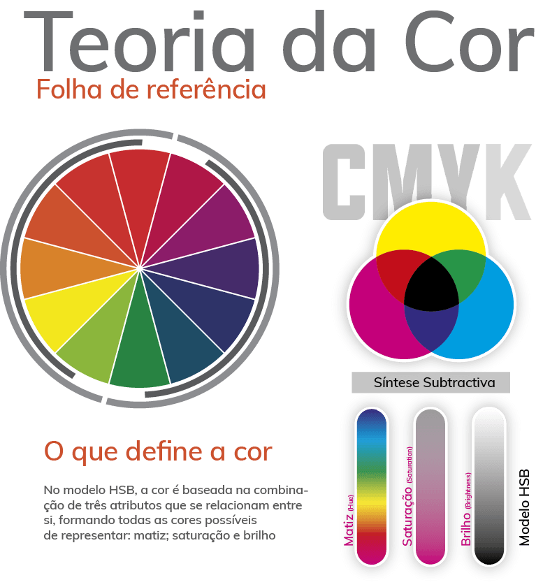
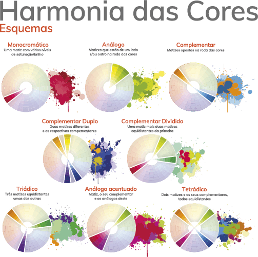
Colour is determined by the brain
When you look at a coloured object, your brain determines its colour in the context of the surrounding colours. The sensation you get when you look at bright complementary colours next to each other is a vibrant or pulsating effect.
It looks like the colours are moving away from each other. It’s caused by an effect called colour fatigue. When a colour hits a portion of the retina long enough, the optic nerve starts sending confusing signals to the brain. This confusion is intensified by the complements. Mixing bright complementary colours draws attention but should be used with restraint.
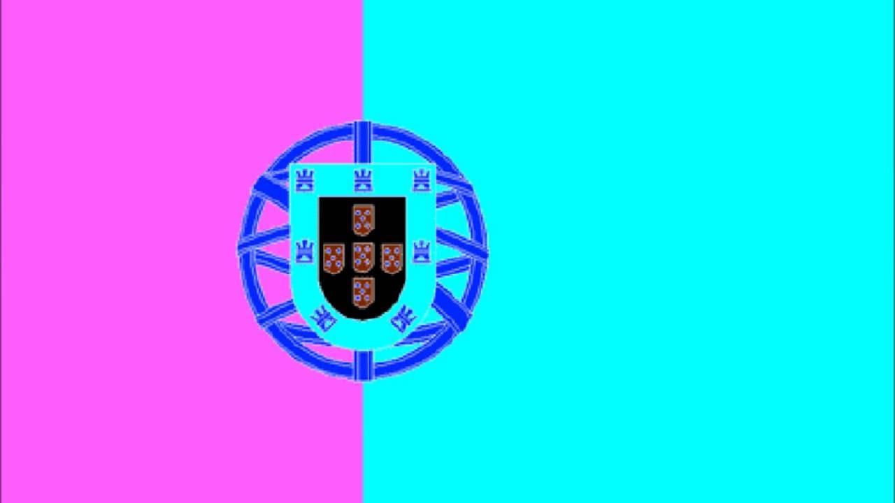
The effect is disconcerting and can make your eyes feel as if they have been shaken. Do the following experiment: Stare at the centre point of the corner area for 30 seconds.
Then close your eyes or look at a white wall. What do you see?
Colour Psychology
Our personal and cultural associations affect our experience of colour. Colours are perceived as warm or cool mainly due to long-standing (and often universal) associations. Yellow, orange and red are associated with the warmth of the sun and fire; blue, green and violet with the coolness of leaves, sea and sky. Warm colours appear closer to the viewer than cool colours, but bright, cool colours can overwhelm light and subtle warm colours. Using warm colours for foreground and cool colours for background enhances the perception of depth. Although red, yellow and orange are generally considered high colours and blue, green and most violets are low tones, the brightness, darkness and lightness of a colour can alter the psychological message.
While a light blue-green appears to be tranquil, damp and cool, a bright turquoise, often associated with lush tropical ocean scenery, will be more exciting to the eye. The psychological association of a colour is often more significant than the visual experience.
Colours act on both the body and the mind. Red has been shown to stimulate the senses and increase blood pressure, while blue and light green has the opposite effect and calms the mind. This is why doctors’ gowns tend to be of these colours. People will actually gamble more and make riskier bets when sitting under a red light, as opposed to a blue light.
That’s why Las Vegas is the city of neon red. For most people, one of the first decisions of the day concerns colour harmony. What am I going to wear?
This question is answered not only by choosing a style and fabric suited to the season, but also by making the right colour choices. And it goes on from there. Whether you are designing a new kitchen, wrapping a gift or creating a bar chart, the colours you choose greatly affect your end results. How many times have you taken a breath when you see a flower bed in full bloom?
Most likely the gardener arranged the flowers according to their colour for an extra vibe. Have you ever seen a film where a co-ordinated colour scheme helps the film create a world unto itself? With a little knowledge of good colour relationships, you can make colour work better for you in your business graphics and other applications. Colour is light and light is energy.
Scientists have discovered that actual physiological changes occur in humans when they are exposed to certain colours (vibrations). Colours can stimulate, excite, depress, tranquilise, increase appetite and create a sense of warmth or coolness. This is known as chromodynamics. There are many stories about the psychological effects of colour such as when a paint company executive received complaints from workers in a blue office that the office was too cold.
When offices were painted with a warm peach, the jumpers came off even if the temperature hadn’t changed. I myself have experimented with pink cardboards showing how the influence of a colour can influence momentary physical strength.
The illusions discussed below will show that sometimes colour combinations can trick the viewer, sometimes in ways that work in your favour. They can also cause unfortunate effects in your graphics, so be sure to watch out for these little pitfalls.
Sometimes colours affect each other in unexpected ways. For example, most colours, when placed alongside their complements, produce vibrant, electric effects. Other colours, in the right combinations, look quite different from what you might expect.
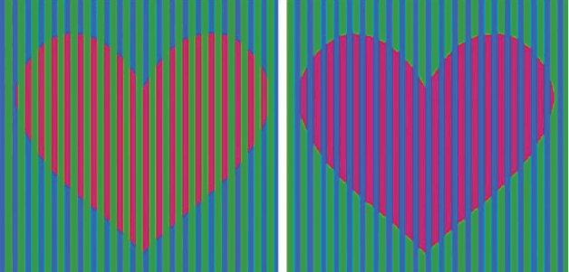
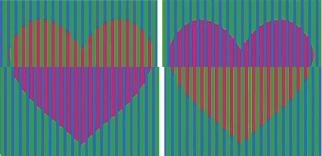
But the most striking colour illusions are those in which identical colours, when surrounded by different backgrounds, appear to be different from each other. In a related effect, different colours can appear to be the same colour when surrounded by certain backgrounds.
In the image below, the heart is the same colour, but because the surrounding areas are markedly different in contrast, it appears to our eyes that they are different. Just as a colour can look different in different environments, two similar colours can look identical under some conditions.
A cor do coração é diferente?
A cor do coração é diferente?
Por esta imagem percebe-se que as cores são iguais.
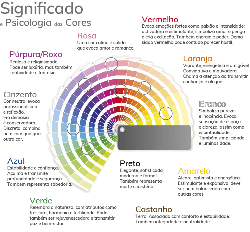
So what is the end result? Experts have found that while colour can have an influence on how we feel and act, these effects are subject to personal, cultural and situational factors. More scientific research is needed to gain a better understanding of colour psychology.
Recommended Books
There are some interesting readings on the subject:
- Eva Heller’s Colour Psychology
- Frédéric Portal’s The Symbolism of Colours
- On a more technical level: Design Elements – Color Fundamentals by Aaris Sherin
I want to know more
We offer a design service that is uniquely tailored to each case, interesting and relevant, not just a pre-defined design package.
Through a consistent work methodology and experience acquired in numerous graphic projects developed, we guarantee success and results.
We want to show you how we can be an asset to your project by giving relevant tips and adapting to your needs.
We stand for authenticity and only suggest what is most valuable to you. By eliminating complexity and shortening delivery timings, we make everything easier on your side. On our side, we always go hand in hand with design thinking, good proportion rules, the latest color principles and theories, best practices in building grids and layouts, user experience, leads, and so on.

