Project Description
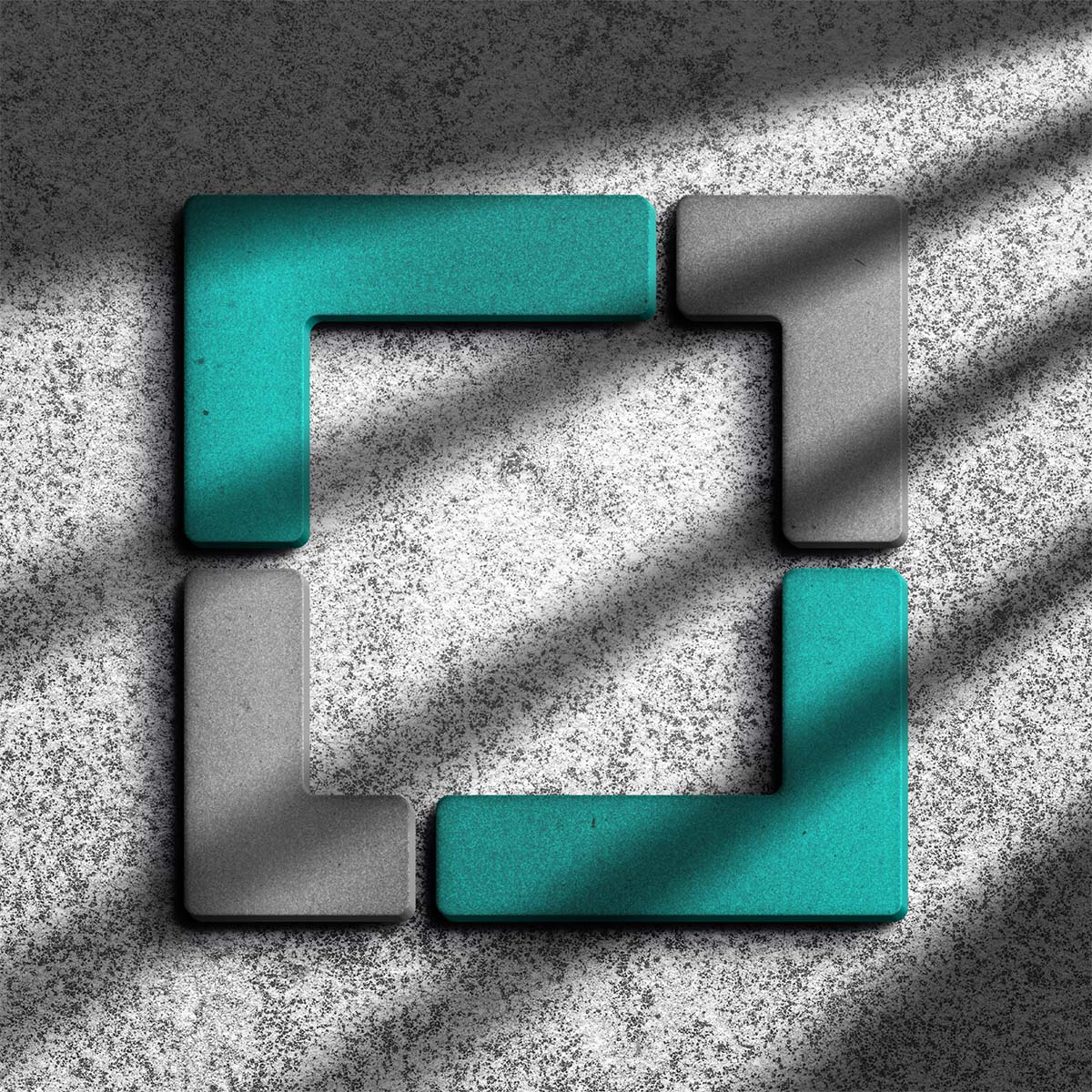
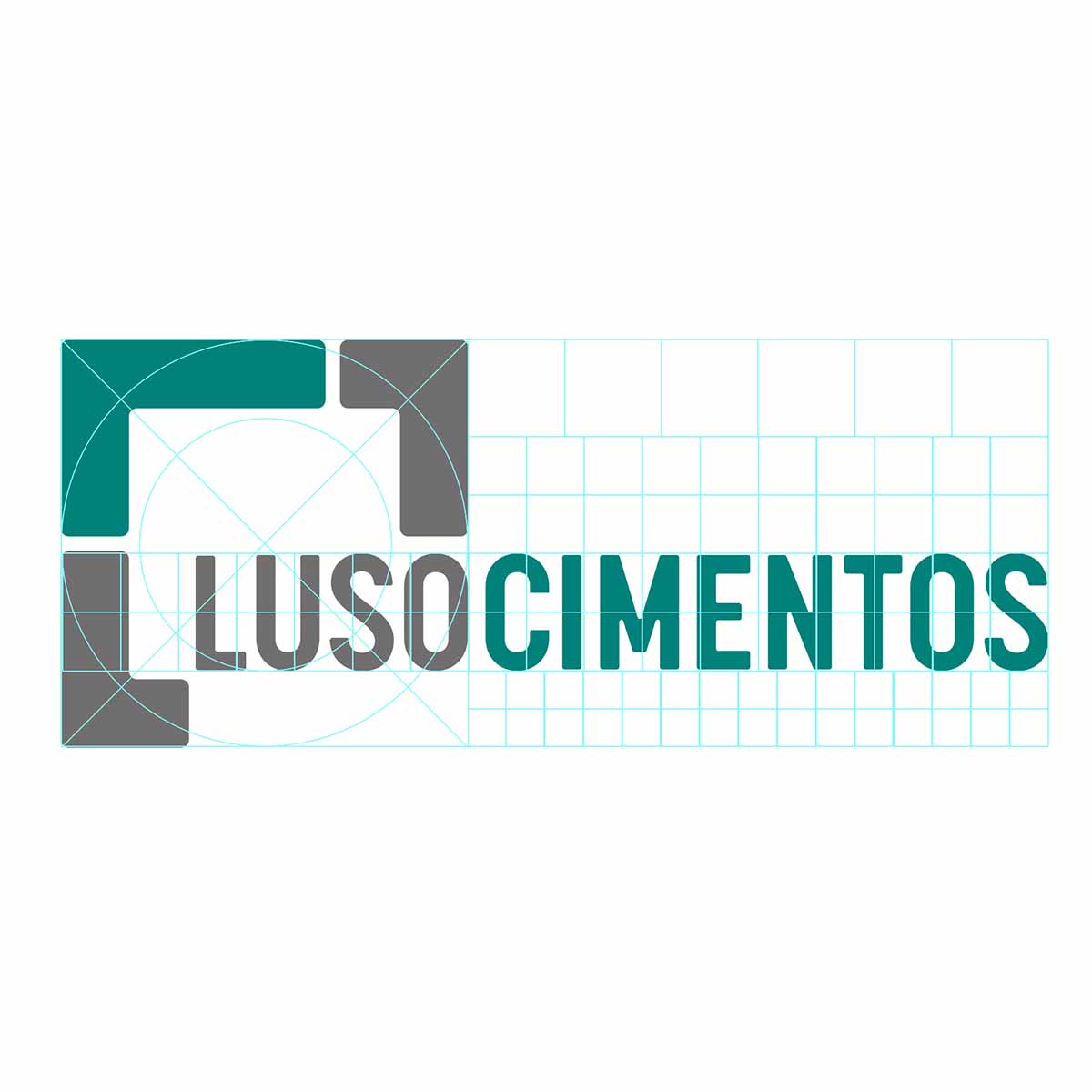
The design of the LUSOCIMENTOS logo is based on a principle of rigour, structural balance and direct reference to the world of construction, reinforcing the brand’s positioning as a new and promising player in the high-quality cement industry. The graphic solution adopts a modular and minimalist geometric configuration, made up of overlapping and interlocking rectangular shapes, conveying the idea of solidity and cohesion while at the same time being timeless and memorable.
The visual structure of the symbol, made up of modules resembling bricks, seeks to establish a direct link with the company’s activities. These modular units, rigorously aligned in a loop, reflect the precision required in cement quality control, as well as the consistency of the final product when used in any structural context. The result suggests robustness and reliability, essential qualities in a technical and demanding sector such as the cement industry, where technical reliability and product consistency are paramount.
We’ll keep you updated as we work on the landing page, external signage and bag design.


