11 Design Principles
While there is much debate about how many design principles there are (and even what they mean), there are some that appear regularly and are more consensual. Design principles are a set of rules that designers can follow when creating a composition to design a visually pleasing and functionally appropriate work.
The aim of these rules is to convey the message in the most organised and functional way possible.
Beyond all the experimentalism, which is always welcome, it is important to know the meaning of the fundamentals, the bases. Every piece of design has a structure beneath the surface that supports it and makes it relevant, interesting and balanced. Beyond all the experimentalism, which is always welcome, it is important to know the meaning of the fundamentals, the bases. Every piece of design has a structure beneath the surface that supports it and makes it relevant, interesting and balanced.
Proportion
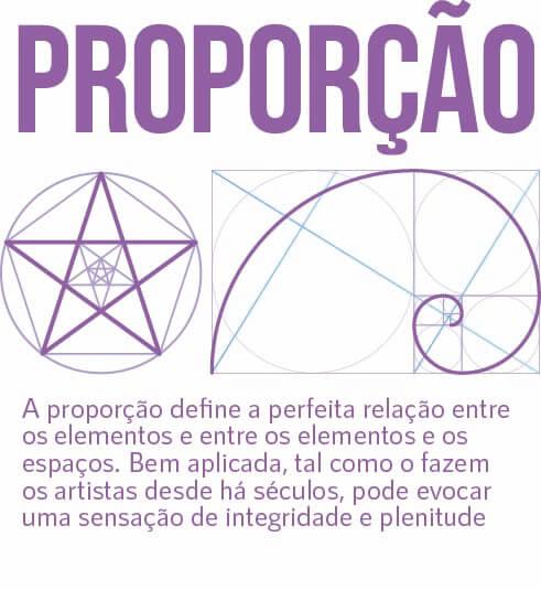
Proportion defines the perfect relationship between elements and between elements and spaces. Applied well, as artists have done for centuries, it can evoke a sense of wholeness and fullness

Space
Proportion defines the perfect relationship between elements and between elements and spaces. Applied well, as artists have done for centuries, it can evoke a sense of wholeness and fullness
Size
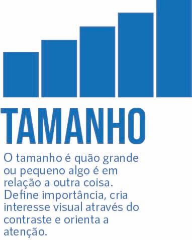
Size is how big or small something is in relation to something else. It defines importance, creates visual interest through contrast and directs attention.
Hierarchy
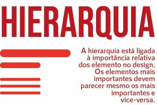
Hierarchy is linked to the relative importance of elements in the design. The most important elements should really appear to be the most important and vice versa.
Contrast
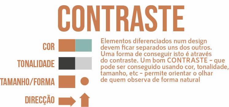
Differentiated elements in a design should stand apart from each other. One way to achieve this is through contrast. A good CONTRAST – which can be achieved using colour, tone, size, etc – allows you to guide the eye of the beholder in a natural way
Repetition
Differentiated elements in a design should stand apart from each other. One way to achieve this is through contrast. A good CONTRAST – which can be achieved using colour, tone, size, etc – allows you to guide the eye of the beholder in a natural way
Variety
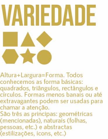
Height+Width=Shape. We all know the basic shapes: squares, triangles, rectangles and circles. Less banal or even extravagant shapes can be used to attract attention. There are three main ones: geometric (mentioned), natural (leaves, people, etc.) and abstract (stylisations, icons, etc.)
Balance
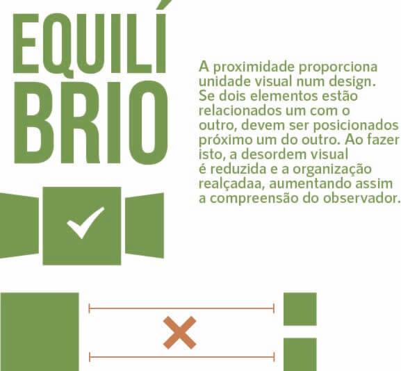
Proximity provides visual unity in a design. If two elements are related to each other, they should be positioned close together. By doing this, visual clutter is reduced and organisation enhanced, thus increasing the viewer’s understanding.
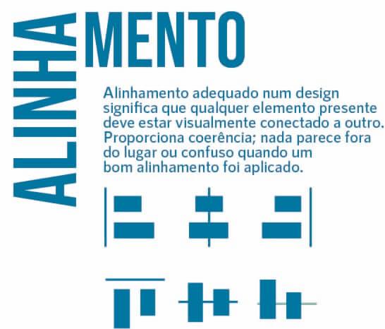
Alignment
Proper alignment in a design means that any element present should be visually connected to another. It provides coherence; nothing looks out of place or confusing when a good alignment has been applied.
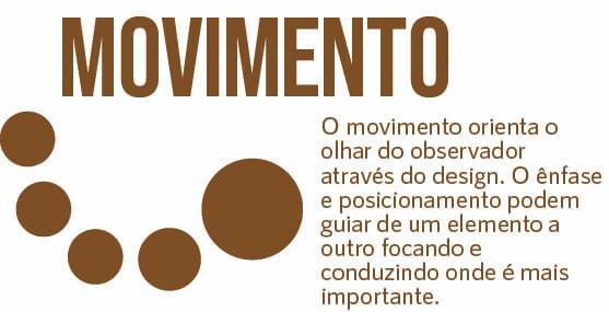
Movement
Movement guides the viewer’s eye through the design. Emphasis and positioning can guide from one element to another by focusing and leading where it is most important.
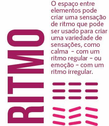
Rithm
The space between elements can create a sense of rhythm that can be used to create a variety of sensations, such as calm – with a regular rhythm – or excitement – with an irregular rhythm.
We want to show you how we can be an asset to your project by giving relevant tips and adapting to your needs.
We stand for authenticity and only suggest what is most valuable to you. By eliminating complexity and shortening delivery timings, we make everything easier on your side. On our side, we always go hand in hand with design thinking, good proportion rules, the latest color principles and theories, best practices in building grids and layouts, user experience, leads, and so on.

