Project Description
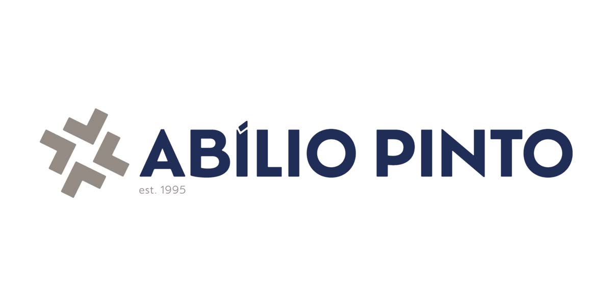
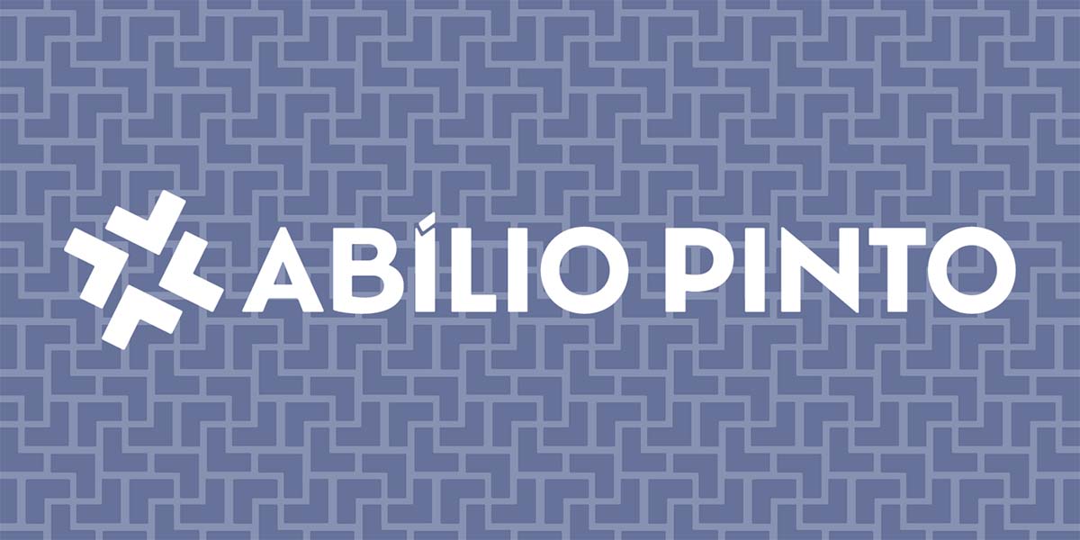
Abílio Pinto’s new logo is the result of a rebranding process that modernizes the brand’s identity while maintaining a clear connection to its legacy.
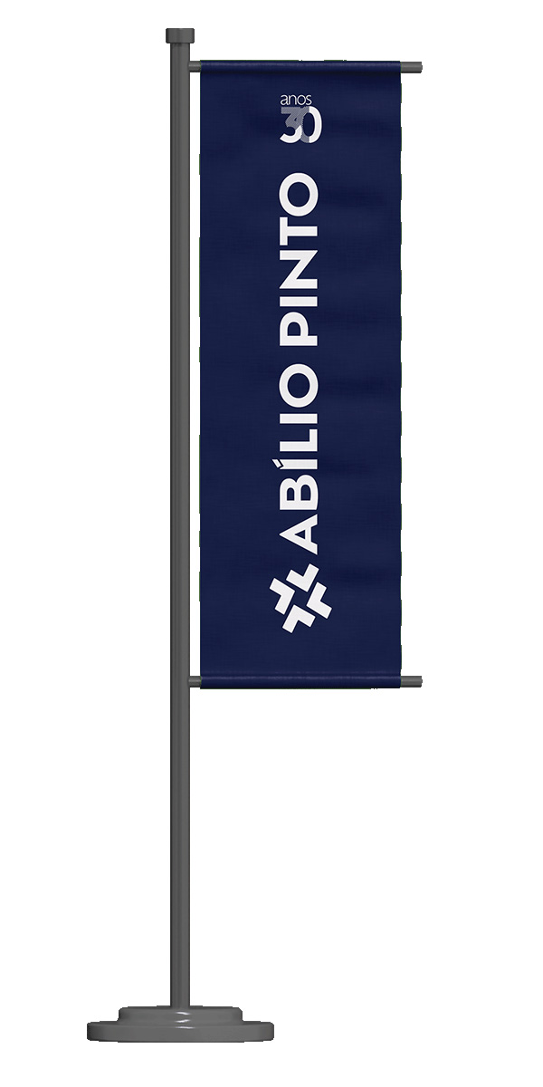
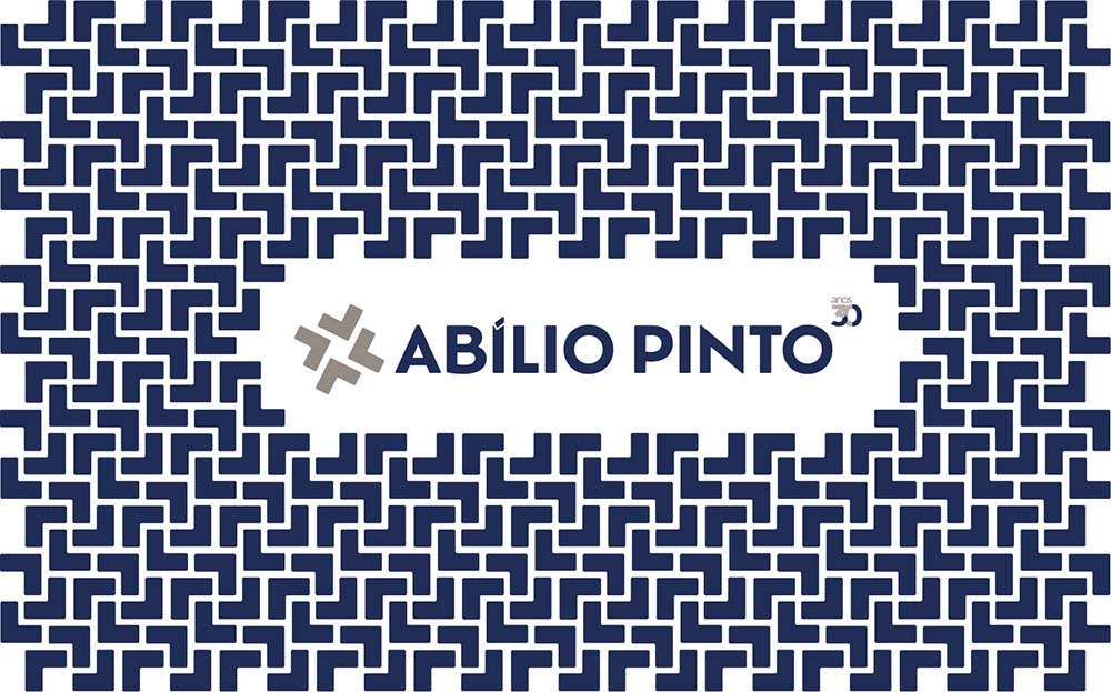
On the occasion of its 30th anniversary, Abílio Pinto asked us to create a commemorative version and a version that will remain in effect after the celebrations.
The new symbol is constructed from modular geometric shapes that, when interconnected, simultaneously evoke:
• Movement and progress, through the implied sense of rotation;
• Rigor and precision, through balanced lines and angles;
• Interconnection and partnership, suggesting elements that come together in a central core, representing proximity to all verticals.
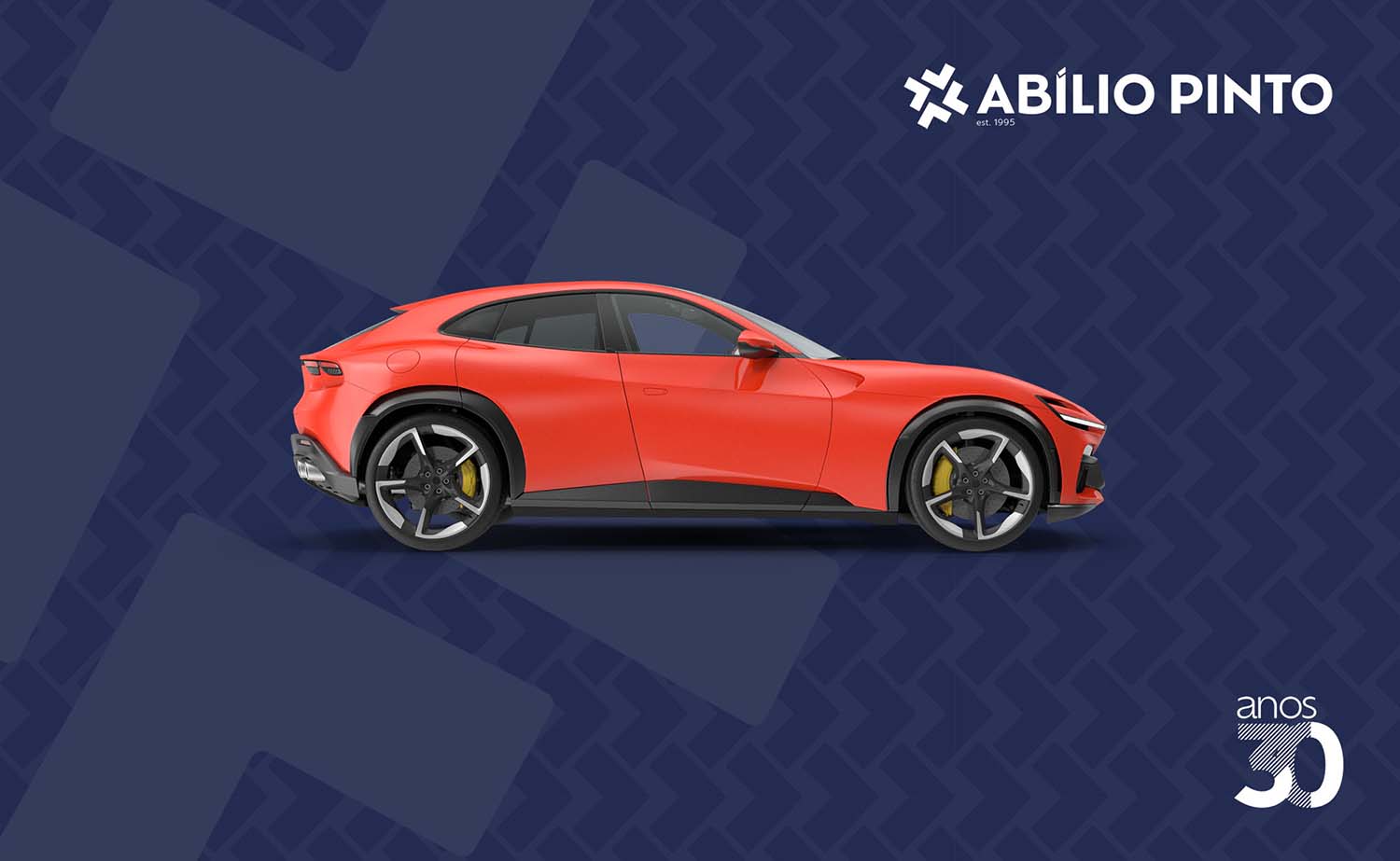
The simplicity of the symbol ensures scalability and cross-cutting applicability.


