Project Description
When designing the logo for Academia Beleza Criativa, we wanted to create a modern, stylised representation that would capture the institution’s essence of innovation and elegance. It is composed of visual elements that convey simplicity, creativity and professionalism, reflecting the values and mission of the academy.
Graphic elements:
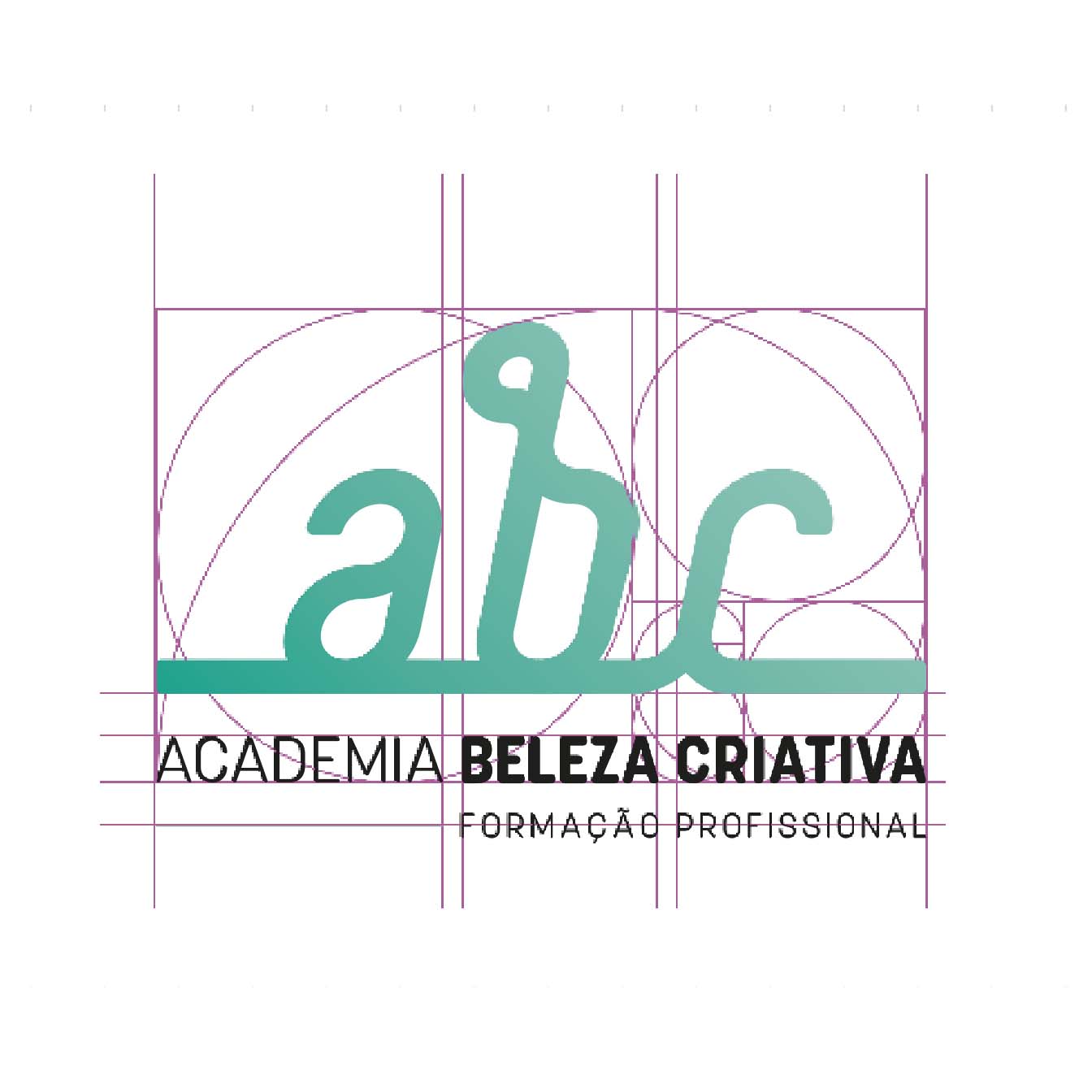
Typography ‘abc’: The choice of a fluid and modern typography for the letters ‘abc’ represents creativity and flexibility, which are fundamental in the field of beauty and styling. The continuous shape of the letters suggests a fluid connection between theory and practice, symbolising the students’ educational and professional path.
Baseline: The baseline underlining the letters ‘abc’ creates a sense of stability and support, reflecting the solid training base that the academy offers. This line also acts as a unifying element, reinforcing the visual cohesion of the logo.
Colours: The use of a turquoise gradient conveys freshness, growth and sustainability, qualities associated with both beauty and the personal and professional development of students. It also evokes tranquillity and balance, values that are essential in the learning environment.
Visual Harmony: The overall design is minimalist and balanced, allowing the logo to be easily recognisable and memorable. The simplicity of the design makes it easy to apply to a variety of promotional materials, from business cards to websites and printed material.
The combination of modern elements and a soft colour palette creates a visual identity that is both welcoming and professional.
Our work also included trade mark registration with the INPI.
